|
Examples / HISTORY.RPF |
HISTORY.RPF does a historical decomposition of a six-variable Canadian model, which includes GDP for Canada and the U.S., the Canadian-U.S. exchange rate, M1, GDP deflator and a short interest rate. This is written to be generalized easily to other sets of variables. Other than the initial set up of variables, you just need to set the decomposition range (HSTART and HEND), change the model name and (perhaps) give the variables and shocks more descriptive name.
The data are quarterly from 1981 through 2006. All variables are transformed to logs except the interest rate:
open data oecdsample.rat
calendar(q) 1981
data(format=rats) 1981:1 2006:4 can3mthpcp canexpgdpchs $
canexpgdpds canm1s canusxsr usaexpgdpch
*
set logcangdp = log(canexpgdpchs)
set logcandefl = log(canexpgdpds)
set logcanm1 = log(canm1s)
set logusagdp = log(usaexpgdpch)
set logexrate = log(canusxsr)
A standard VAR with four lags is created and estimated:
system(model=canmodel)
variables logcangdp logcandefl logcanm1 $
logexrate can3mthpcp logusagdp
lags 1 to 4
det constant
end(system)
*
estimate(noprint,noftests,resids=resids)
The historical decomposition needs to be done within the existing sample. This sets the range used for this. With HSTART=2003:1, the base forecasts will be computed using data through 2002:4 (the period before 2003:1).
compute hstart=2003:1
compute hend =2006:4
The next block pulls information out of the model. The VARLABELS are the labels of the dependent variables, while the SHOCKLABELS are the labels of the shocks. Here (with Cholesky shocks), they are the same. In practice, they might not be. And in practice, you might want to use more descriptive labels, which you can do using COMPUTE, for instance, something like
compute varlabels=||"Canadian Real GDP","GDP Deflator",...||
compute neqn=%modelsize(canmodel)
dec vect[int] depvar(neqn)
dec vect[string] varlabels(neqn) shocklabels(neqn)
ewise varlabels(i)=%modellabel(canmodel,i)
ewise shocklabels(i)=%modellabel(canmodel,i)
compute depvar=%modeldepvars(canmodel)
This does the decomposition using HISTORY. If you want non-Cholesky shocks, you can use a FACTOR option on the HISTORY. The ADD option has the base forecast added to the EFFECTS so that each will show the what the data would be without any of the other shocks.
history(model=canmodel,add,base=base,effects=effects,$
from=hstart,to=hend)
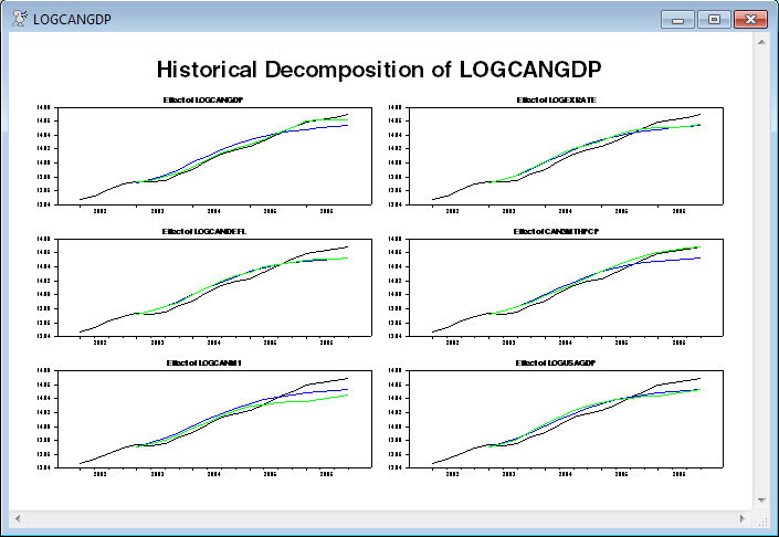
The information is displayed with a separate page of graphs for each dependent variable. With six graphs per page, this will do a 3 x 2 layout with the graphs of the effects of the six shocks on that variable. (The rows are rounded down in the calculation of rows and columns so the rows will be no larger than the number of columns).
This graphs the actual data (including four pre-sample values, by starting the graph range at HSTART-4), the base forecast, and the effects of shock J on variable I.
compute rows=fix(sqrt(neqn))
compute cols=(neqn-1)/rows+1
do i=1,neqn
spgraph(vfields=rows,hfields=cols,window=varlabels(i),$
header="Historical Decomposition of "+varlabels(i))
do j=1,neqn
*
* This graphs the actual data (including four pre-sample values),
* the base forecast, and the effects of shock J on variable I.
*
graph(header="Effect of "+shocklabels(j)) 3
# depvar(i) hstart-4 hend
# base(i)
# effects(i,j)
end do j
spgraph(done)
end do i
The above (the first of the graphs is shown below) is the standard way to graph the historical decomposition.
The following does an alternative with a stacked bar graph for the effects of the shocks, overlaid with the actual data (just for the first dependent variable, Canadian GDP). (For various reasons, this probably isn't a great idea but is being shown for illustration. This is discussed in the notes to the sample graph).
Unlike the above, this uses the NOADD option on HISTORY so the effects of the shocks are separated from the underlying forecast.
history(model=canmodel,noadd,base=base,effects=effects,from=hstart,to=hend)
The graph will have a stacked bar for the effects of the shocks with an overlay line for the actual data. It will use the SERIES option on the GRAPH which requires that the data to be graphed be arranged as a VECTOR of series handles (INTEGERs). This is arranged to have the effects of the shocks first, with the dependent variable last. Again, note that this is for the 1st variable only—that's the 1 in the depvar(1) and in effects(1,j).
dec vect[int] byshock(%nvar+1)
ewise byshock(j)=%if(j==%nvar+1,depvar(1),effects(1,j))
This puts together the corresponding key labels for the series being graphed:
dec vect[strings] histlabels(%nvar+1)
ewise histlabels(j)=%if(j==%nvar+1,%l(depvar(1)),shocklabels(j))
and this shifts the colors so the overlay line for the data is black and the bars are colored.
dec vect[int] symbols(%nvar+1)
ewise symbols(j)=%if(j==%nvar+1,1,j+1)
This does the actual graph. The SMPL instruction is used to make sure it graphs everything just over the decomposition range. The main graph is STYLE=STACKEDBAR, with a line graph (with the actual data) overlaying that. Note that this uses different scales (NOOVSAMESCALE which is the default, so it doesn't need to appear) since the line graph has the values of the data while the effects are just the accumulated shocks only and start at 0.
smpl hstart hend
graph(series=byshock,style=stackedbar,overlay=line,$
symbols=symbols,key=below,klabels=histlabels,$
vlabel="Shocks",ovlabel="Data")
smpl
The blank SMPL at the end makes sure that if anything is added after this (it's the last instruction in the existing program), it won't have analysis ranges affected by the SMPL intended only for the graph.
Full Program
open data oecdsample.rat
calendar(q) 1981
data(format=rats) 1981:1 2006:4 can3mthpcp canexpgdpchs $
canexpgdpds canm1s canusxsr usaexpgdpch
*
set logcangdp = log(canexpgdpchs)
set logcandefl = log(canexpgdpds)
set logcanm1 = log(canm1s)
set logusagdp = log(usaexpgdpch)
set logexrate = log(canusxsr)
*
system(model=canmodel)
variables logcangdp logcandefl logcanm1 $
logexrate can3mthpcp logusagdp
lags 1 to 4
det constant
end(system)
*
estimate(noprint,noftests,resids=resids)
*
* This sets the range for the historical decomposition, so the base
* forecasts are computed using data through 2002:4 (the period before
* 2003:1).
*
compute hstart=2003:1
compute hend =2006:4
***********************************************************************
*
* These pull information out of the model. The VARLABELS are the labels
* of the dependent variables, while the SHOCKLABELS are the labels of
* the shocks. Here (with Cholesky shocks), they are the same. In
* practice, they might not be. And in practice, you might want to use
* more descriptive labels, which you can do using COMPUTE, for instance,
* something like compute varlabels=||"Canadian Real GDP","GDP
* Deflator",...||
*
compute neqn=%modelsize(canmodel)
dec vect[int] depvar(neqn)
dec vect[string] varlabels(neqn) shocklabels(neqn)
ewise varlabels(i)=%modellabel(canmodel,i)
ewise shocklabels(i)=%modellabel(canmodel,i)
compute depvar=%modeldepvars(canmodel)
*
* If you want non-Cholesky shocks, you can use a FACTOR option on the
* HISTORY. You might want to input more descriptive values for the
* SHOCKLABELS if you do that.
*
history(model=canmodel,add,base=base,effects=effects,from=hstart,to=hend)
*
* This does a separate page of graphs for each dependent variable. With six graphs
* per page, this will do a 3 x 2 layout with the graphs of the effects of the six
* shocks on that variable. (The rows are rounded down so they will be no larger
* than the number of columns).
*
compute rows=fix(sqrt(neqn))
compute cols=(neqn-1)/rows+1
do i=1,neqn
spgraph(vfields=rows,hfields=cols,window=varlabels(i),$
header="Historical Decomposition of "+varlabels(i))
do j=1,neqn
*
* This graphs the actual data (including four pre-sample values),
* the base forecast, and the effects of shock J on variable I.
*
graph(header="Effect of "+shocklabels(j)) 3
# depvar(i) hstart-4 hend
# base(i)
# effects(i,j)
end do j
spgraph(done)
end do i
*
* This does a stacked bar graph for the effects of the shocks,
* overlaid with the actual data (just for the first dependent
* variable, Canadian GDP). (For various reasons, this probably
* isn't a great idea but is being shown for illustration).
*
* This uses the NOADD option so the effects of the shocks are
* separated from the underlying forecast.
*
history(model=canmodel,noadd,base=base,effects=effects,from=hstart,to=hend)
*
* Arrange the series to be graphed to have the effects of the shocks
* first and the dependent variable last.
*
dec vect[int] byshock(%nvar+1)
ewise byshock(j)=%if(j==%nvar+1,depvar(1),effects(1,j))
*
* Put together the corresponding key labels
*
dec vect[strings] histlabels(%nvar+1)
ewise histlabels(j)=%if(j==%nvar+1,%l(depvar(1)),shocklabels(j))
*
* This shifts the colors so the overlay line for the data is black and
* the bars are colored.
*
dec vect[int] symbols(%nvar+1)
ewise symbols(j)=%if(j==%nvar+1,1,j+1)
*
smpl hstart hend
graph(series=byshock,style=stackedbar,overlay=line,$
symbols=symbols,key=below,klabels=histlabels,$
vlabel="Shocks",ovlabel="Data")
smpl
Graphs
This generates six pages of graphs (one for each series). The following is the first of the six. With this color scheme, the black line is the actual data, the blue is the base forecast (which starts a year into the graph) and the green is the base forecast plus the effects of the shock in question (that is, the LOGCANGDP shocks in the top left graph). The gaps between the green and blue lines summed across all six series add up to the gap between the black and blue. Note that those gaps can take either sign.
After these (which is a "traditional" way to display the historical decomposition), there is a different style graph which does the accumulated effects of the shocks using a stacked bar graph:
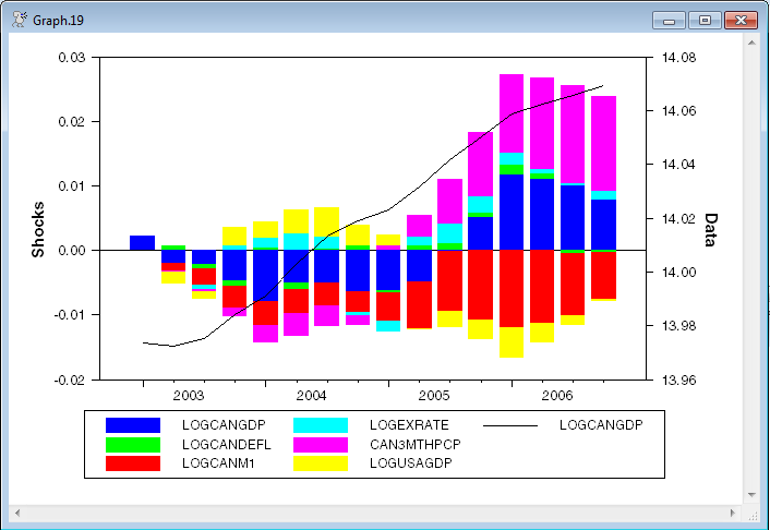
While this style graph is quite attractive, it has several important drawbacks:
1.Stacked bar graphs generally, and the positive-up and negative-down graphs specifically, are hard to follow for any series other than the first one because of the moving baselines.
2.The overall effect of shocks on the dependent variable is the difference between the up and the down, but the visual cue is to add since that's overall length of the bar.
3.This looks fine in color. Try to convert that to black and white to put it into a journal, and you can't tell what's going on.
Copyright © 2026 Thomas A. Doan