|
Graphics / Overlay (Two Scale or Two Style) Graphs |
The OVERLAY option makes it easy to do a GRAPH or SCATTER plot with two different vertical scales. It also allows you to combine two different styles. For example, you can graph some series using a line style and others using a bar graph style.
By default, the scale for the first set of series appears on the left side of the graph, while the scale for the second set of series appears on the right side of the graph. You can use the OVSAMESCALE option (along with OVERLAY) if you want to use the same scale for both axes, but with different styles for different series.
Creating Overlay Graphs
Here is the basic procedure for creating an overlay graph:
•Use the OVERLAY option on your GRAPH or SCATTER instruction to tell RATS to do an overlay graph. OVERLAY offers the same choices as STYLE, but it sets the style used for the overlaying (right-scale) series. The STYLE option itself applies only to the left-scale series.
•If you are only graphing two series (or two pairs of series for SCATTER), you don’t need to do anything else. Just list the series on separate supplementary cards, as you would for an ordinary graph. The second series (or pair) are graphed using the OVERLAY style and scale.
•If graphing more than two series, use the OVCOUNT option to tell RATS how many series should be graphed using the right-side (overlay) scale. For OVCOUNT=n, RATS graphs the last n series (or pairs) listed using the right-side scale.
Notes
When you use the OVERLAY option, RATS ignores the AXIS, EXTEND, and SCALE options on GRAPH and the AXIS, EXTEND and VSCALE options on SCATTER. This is because running an axis line or extending grid lines across the graph is likely to be very distracting, as they will apply to only one of the two scales. All other options, such as HEADER, HLABEL, and GRID, work normally.
You can use the OVLABEL option to label the right-side scale. Use the standard VLABEL option if you want to label the left-side scale.
The OMAX and OMIN options set the maximum and minimum values for the right-side scale. They function just like the MAX and MIN options, which will control only the left-side scale in a two-scale graph.
If you want to use one of the “painted” styles, such as POLYGONAL or BARGRAPH, you should probably use that as the STYLE (left-scale), as these are drawn first. If you use a paint style for the overlaying series, they may cover up the first block of series.
You can use the OVRANGE option to offset the two scales so they aren’t directly across from each other. OVRANGE=fraction gives each scale the given fraction of the vertical size (fraction should be in the range 0.5 to 1.0). OVRANGE=.6 for instance will have them overlap only slightly (the left scale getting the bottom 60% and the right getting the top 60%).
Examples
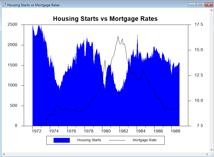
This simple example (from GRAPHOVERLAY.RPF) graphs two series. The series HSF (housing starts) is graphed using the POLYGONAL style, and its scale appears on the left side of the graph. The series FCME (mortgage rates) is graphed as a LINE, and uses the right-side scale.
You will probably need to experiment with the stylenum parameters to get overlay graphs to look good. Here, we have used fill pattern 2 (blue in color and medium gray in black and white) for the HST series, and line type 1 (solid black) for the FCME series. Without these, HST would be graphed using a solid black pattern (pattern 1), and FCME, which would be a blue or dashed line, would not be as visible. We also used KLABEL to supply custom key labels.
open data haversample.rat
calendar(m) 1972
data(format=rats) 1972:1 1988:12 fcme hst
graph(key=below,header="Housing Starts vs Mortgage Rates",$
klabel=||"Housing Starts","Mortgage Rate"||,$
style=polygonal,min=0.0,overlay=line) 2
# hst / 2
# fcme / 1
Copyright © 2026 Thomas A. Doan